Client Spotlight: Chosen Foods
Working with photography & video clients is so rewarding. I’ve focused mostly on product companies because I think there’s great opportunity for creativity and continued relationships given my experience in the field. I like being able to work with a client for an extended period of time. Solving branding needs and seeing how the effort and new assets impact the business in a positive way.

The mission of Chosen Foods is to support true nourishment through the rediscovery and accessibility of real food. They create products that are very natural, healthy and real. For the past 6+ months I’ve helped them with photography, video and design.
Product Catalog
The catalog is an important tool for the sales team to showcase the line of products to potential custumers. And since you only get one chane to make a good first impression i wanted the initial reveal to be interesting and welcome the viewer.
The photo of the catalog here is a bit funny. Some of the packaging has my photos on the labels, the catalog has photos of the packaging and this is a photo of the catalog. Essentially a photo of a photo of a photo of mine 😉
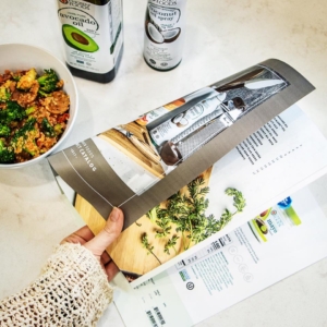
Catalog Cover
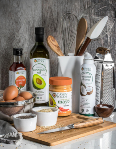
For the cover we created a still life, similar to a dutch painting but lighter and happier. We wanted to show a typical kitchen slightly in disarray with a selection of key products. Showing how well the product belongs in a natural setting with an artistic flair.
Inside Spread
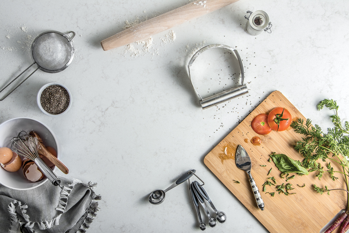
For the inside spread I shot an overhead image of the same kitchen after cooking a meal. This was particularly challenging. Finding the right quantity of items in the right place in the right way. With the iPad on wifi to view the composition it was an achievable project. Showing just a few elements of the product and giving the viewer a sense, a mood and a feeling that this is a brand that belongs in this environment: your home.

Avocado Oil Product Video
Video is so hot right now. Any brand that wants to really communicate with its sudience needs to consider video. If an image speaks 1000 words then a video is showing 30 of those per second. Video also helps a company become more, a brand, a brand with a personality that the audience can relate to.
Chosen Foods is starting to get into video. I presented the variety of possible videos worth making. The goal of each type, its complexity and my recommendation of where to begin were discussed. With video its more than just showing up with a camera and start shooting. Theres alot of planning involved. Mood boards, style sheets, story boards. Well the idea isnt to make things too complex but preperation helps to create success.
For Chosen Foods we decided to start with a product hero video of one of their primary products: Avocado Oil. The purpose to highlight the product, quickly give its benefits then show some of its primary uses in a way that makes the audience want to be invloved and ultimately want to make a purchase they are happy with.

Negative Spaces
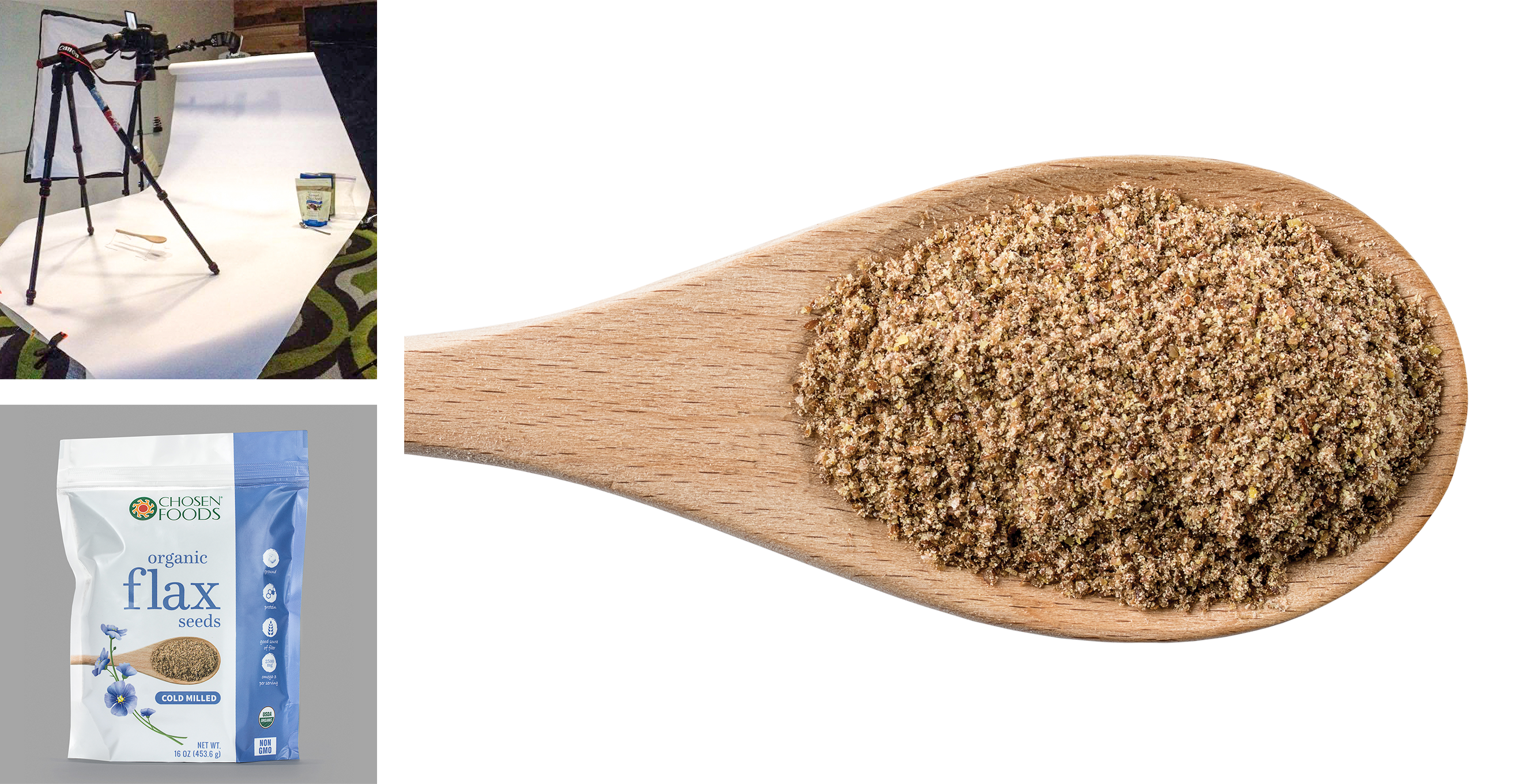
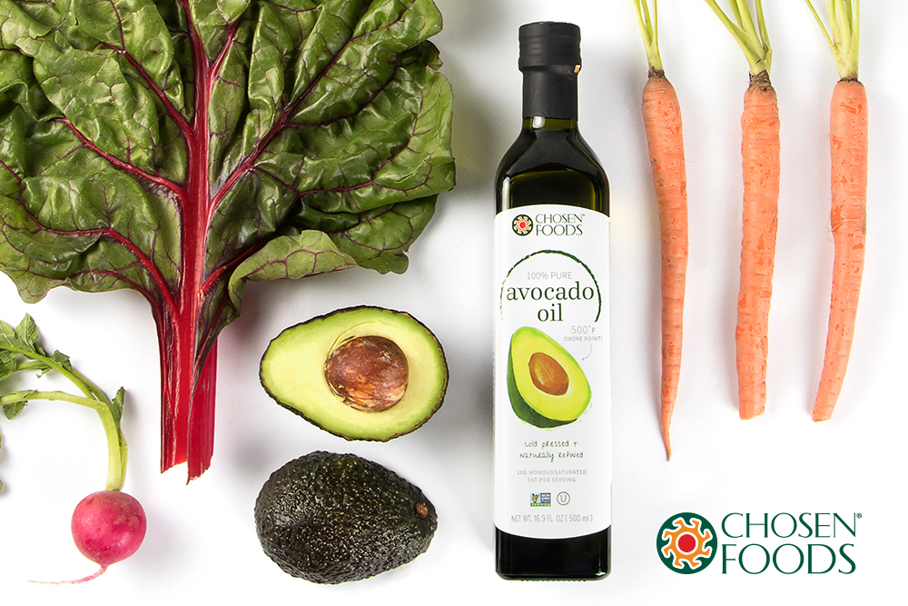
Chosen Foods has alot of places they need to use images. From the website, to social channels, to print ads, to packaging, retail graphics and more. Most of these uses invlove graphic design so in commercial photography its often important to leave negative spaces in some shots where text, graphics and logos can be added and feel naturally part of a composition.
Planning
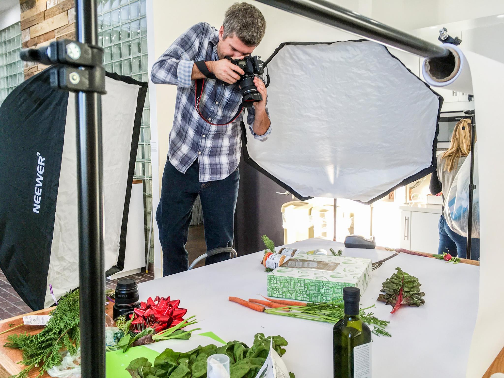
Photography is fun but work is work and for a business client it needs to be treated with careful planning. There are budgets to maintain and wasting time is a no no. So sometimes an excel sheet listing all products with marks on which images are needed, have been shot, need to be edited, etc. can really help the whole process move smoothly and professionally.

Texture
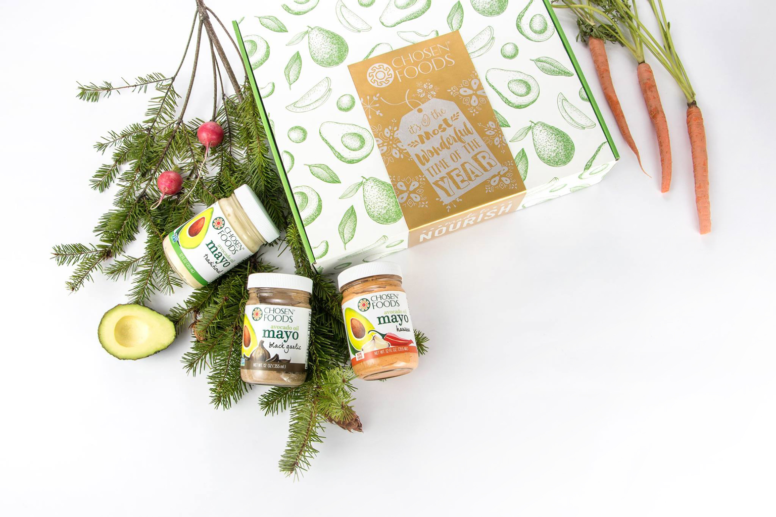
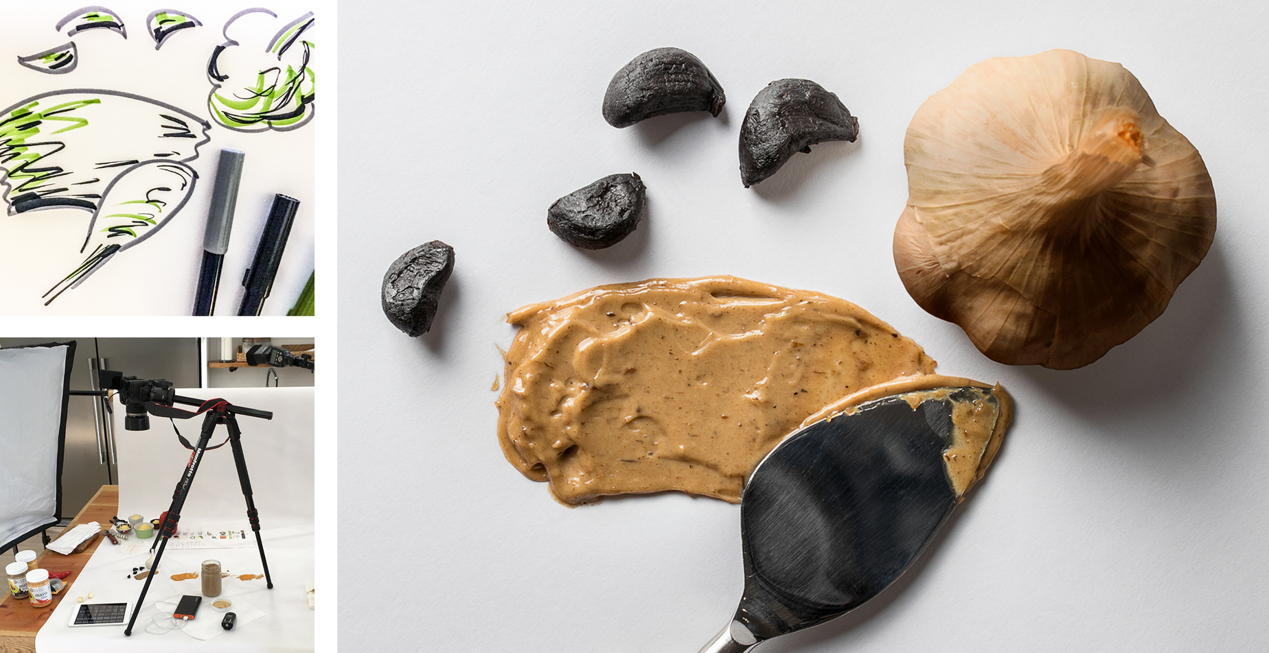
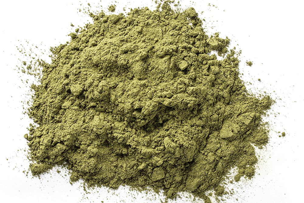
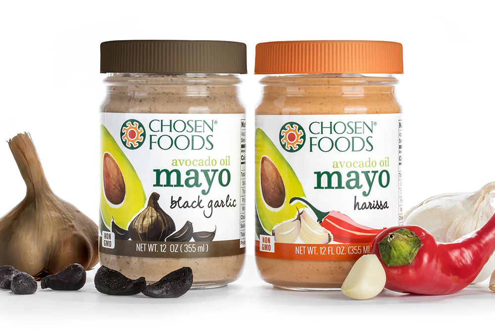
Ive thought this for awhile myself and then was validated when i saw it written in an article: Texture is good. Brands are really benefiting from product photography that includes texture. Nike showing the fabric texture of their apparel, showing texture on their shoes to show breathability. Texture really helps a viewer get a feel for the product and often an important feature. For the mayonaise products I wanted to show texture. I wanted to show how thick it is when it spreads and even see the bits of ingredient like garlic that add to the flavor. Along with the actual ingredients of black garlic cloves and their texture you really start to sense the taste by just looking at the photo.
I hope you’ve enjoyed this insight to my work with this client.
Thanks for viewing.
Would you like to make a donation?
I hope you’ve enjoyed this blog post.
If you’d like to see more posts like this please donate to LensLife Photo.
Thanks! 🙂
